
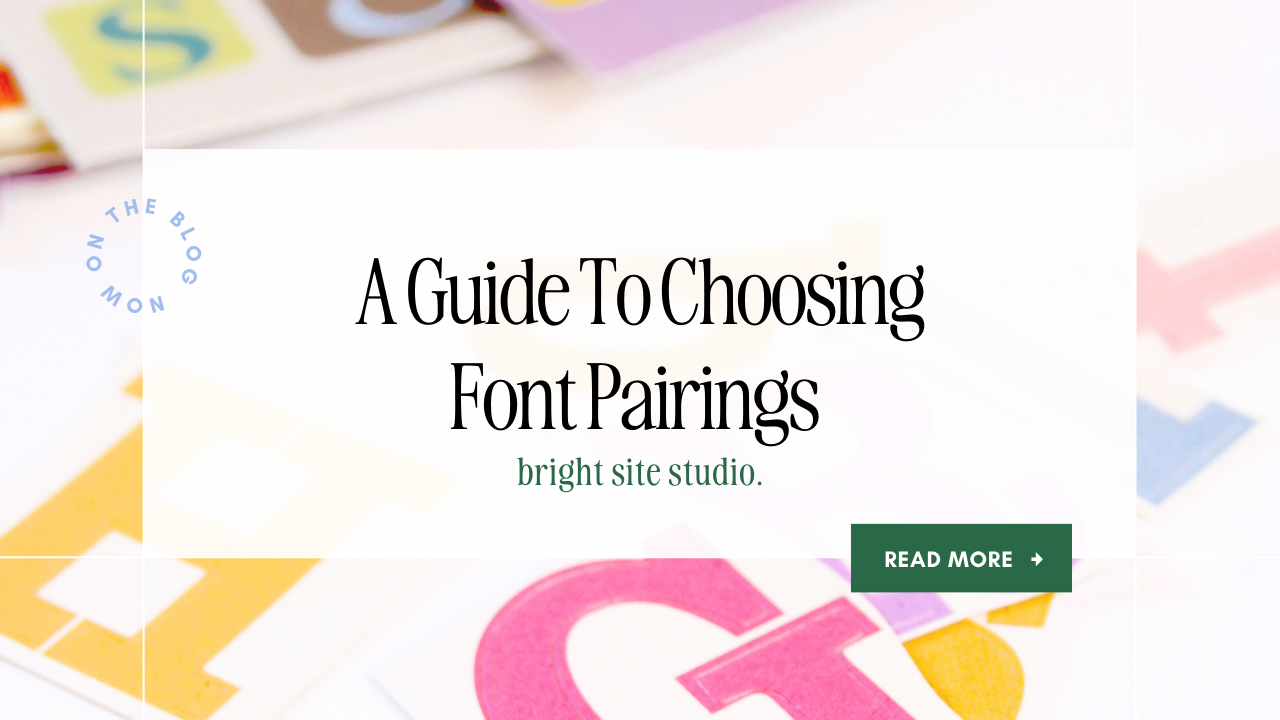
A Guide to Choosing Font Pairings
Fonts are a powerful design element that can greatly impact the visual appeal and readability of any content, including your website. Choosing the right font pairing is crucial to creating a harmonious and engaging design. We'll explore font pairings, offering tips and examples to help you elevate your design and brand.
Understanding Font Families:
Before diving into font pairings, it's essential to understand the basic categories of fonts. Fonts can be put into four main categories: serif, sans-serif, script, and display. Each category has its own unique characteristics, and understanding them can really help in creating font combinations.
-
Serif Fonts:
- Classic and traditional.
- Ideal for print and long-form content.
- Examples: Times New Roman, Georgia, Garamond.

2. Sans-serif Fonts:
- Modern and clean.
- Great for digital platforms and short-form content.
- Examples: Helvetica, Arial, Roboto.

3. Script Fonts:
- Elegant and handwritten.
- Best for decorative or formal designs.
- Examples: Sacramento, Dancing Script, Stalemate.

4. Display Fonts:
- Creative and attention-grabbing.
- Best for headlines and logos.
- Examples: Impact, Futura, Bebas Neue.
Creating Contrast:
Contrast is key to a successful font pairing. It adds visual interest and helps guide the reader's eye. When selecting fonts, aim for a balance of contrasting elements such as size, weight, and style. For instance, pairing a bold sans-serif headline with a clean lined serif font for body text can create a visually appealing contrast. And using a script font for feature text or subheadings.
Consider Hierarchy:
Establishing a clear hierarchy in your design is crucial for effective communication. Choose fonts that naturally convey hierarchy through variations in size, weight, or style. A common approach is to use a bold sans-serif for headlines, a regular serif for subheadings, and a standard sans-serif or serif for body text.
Complementary Fonts:
While contrast is essential, ensuring that fonts complement each other is equally important. Look for fonts with similar proportions, heights, or letterfs that share common elements. This creates a cohesive look.
Examples of Font Pairings which you can find in Kajabi:
-
Roboto (Sans-serif) + Merriweather (Serif):
- A modern and clean combination for websites and digital content.

- A modern and clean combination for websites and digital content.
-
Playfair Display (Serif) + Raleway (Sans-serif):
- A classic and elegant pairing suitable for print materials and formal documents.

- A classic and elegant pairing suitable for print materials and formal documents.
-
Dancing Script (Script) + Open Sans (Sans-serif):
- A playful and modern combination for creative designs and branding.

- A playful and modern combination for creative designs and branding.
Choosing the right font pairing can really impact of your design. By understanding font families, creating contrast, considering hierarchy, and selecting complementary fonts, you can elevate your typography game and create visually stunning and effective designs. Experiment with different combinations, trust your instincts, and enjoy the creative process of finding the perfect fonts for your projects.